I love that surf has its own look and feel, and it certainly helps me find new surf records. What's interesting about this year is that I didn't notice as many bands adhering to that look and feel, and part of that was a surprising no-show from some of the heavyweights of this genre, such as Shawn Dickinson and Fred Lammers. Here's what stuck out to me.
Honorable Mentions
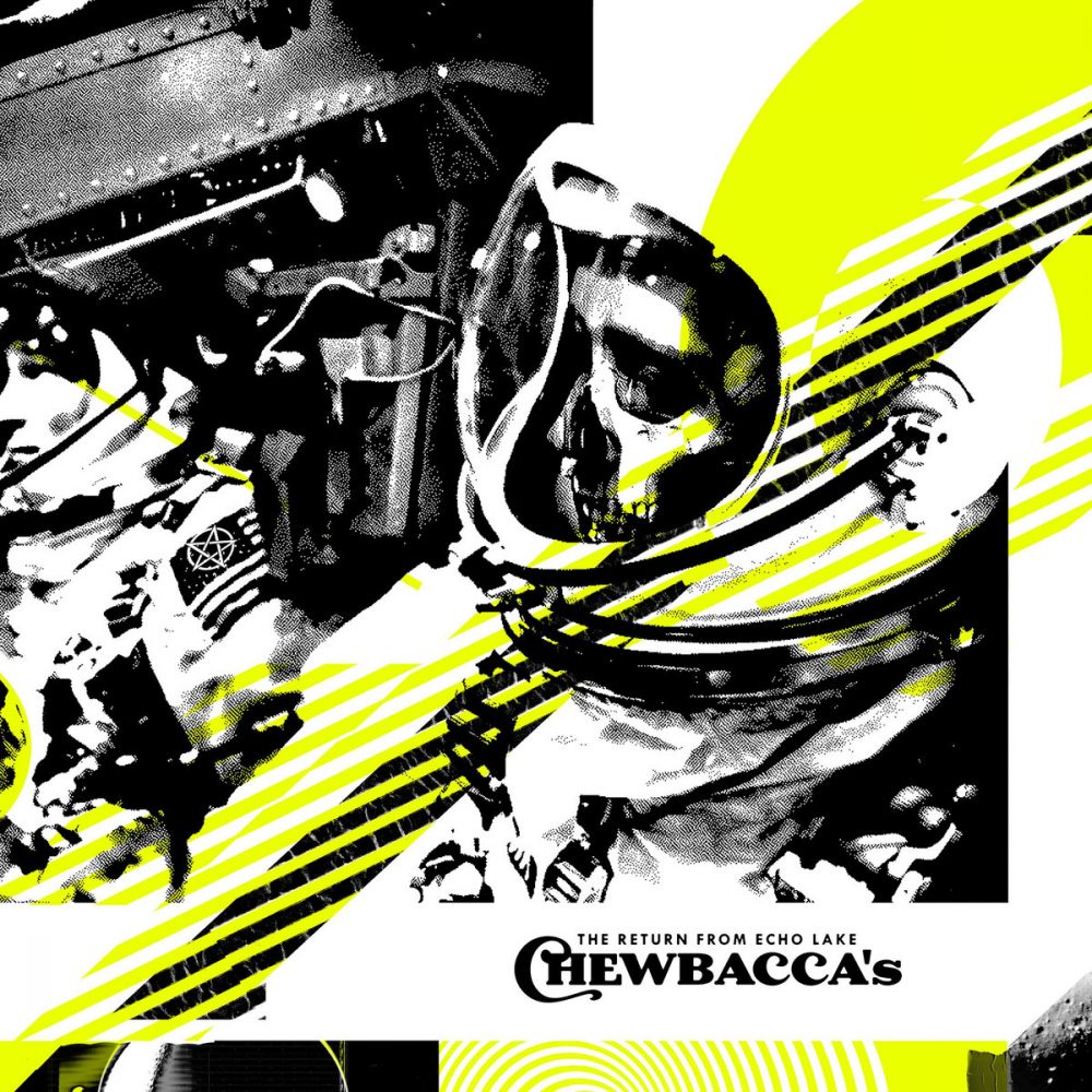
Chewbacca’s - The Return from Echo Lake
By Mik Baro
This is compelling pretty quickly with the chaotic graphic design elements and the fuzzy photocopy pattern obscuring detail enough for intrigue. But seeing this in-person with a vinyl copy is where it really shines, seemingly screen-printed by hand with the yellow elements bleeding over the black. That yellow is eye-ball burning electric in person and the matte finish of the vinyl looks great. Plus the Japanese-styled obi strip is a cool touch.
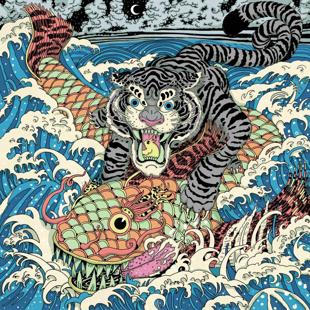
Outersea - Outersea
No detail spared with this Japanese inspired illustration. It’s busy as hell and you can feel the thrashing of that big ol’ fish. They went the extra mile with shadows from the wave crests and then goofy details you don’t notice at first like the fish’s tongue, the glowing moon and, of course, the singing bird in the tiger’s mouth.
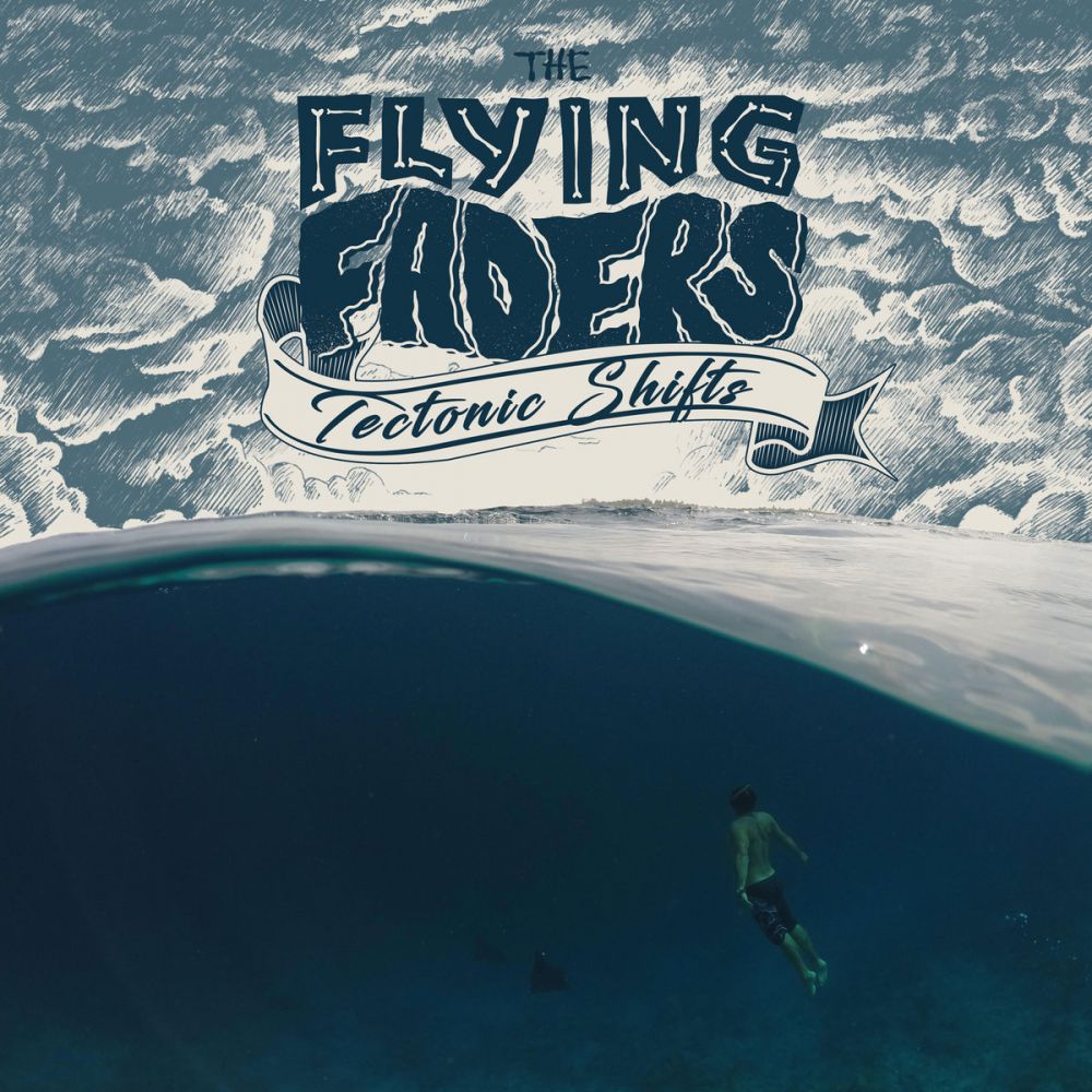
The Flying Faders - Tectonic Shifts
Really cool mix of hand-drawn and photograph elements, and I love the way the water bisects the image and leaves a big ol’ chunk of tasteful negative ocean space below. There’s a great sense of space and depth that lends a sense of mystery that makes you wanna hear this record!
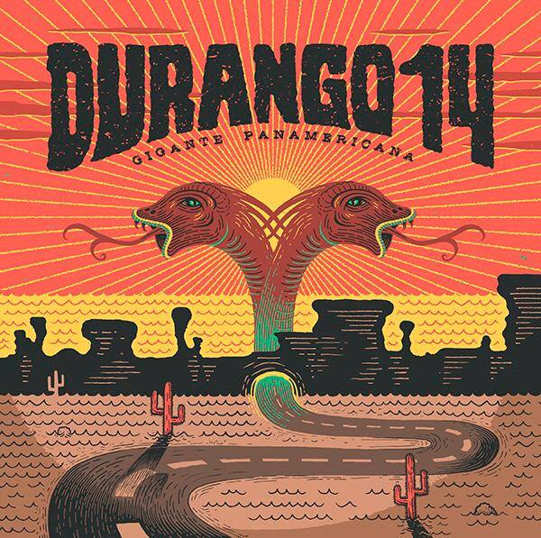
Durango 14 - Gigante Panamericana
By Oskar Benas
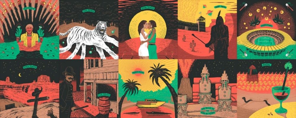
The album cover is good, but what I really appreciate here is the way they rolled out an entire brand! Each song has an illustration, staying in that style and color scheme (which allows a merch page with a mind-numbing variety). The images are all wild and strange, and it fits their music and their zebra-lined outfits.
What’s especially fun here is that the artist is Oskar Benas, whose alien surf sounds have graced the Gremmy Awards in the past.
And the Gremmy goes to...
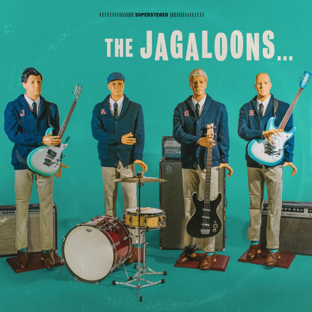
Jagaloons - Ruin the Party
Just when you thought you’d seen every variety of band line-up photo, there’s these dummies. It feels classic and unassuming, but it's also strange, humorous, and a little disturbing. At first I looked at it and thought these were dolls, but the details seemed too intricate and the instruments certainly didn’t look miniature (though they still don’t look normal either). Are these people made to look like mannequins? Did they seriously grab four mannequins? Nope, they bought one and shot it four times with small differences. The back of the LP is fun too, showing a post-party mess with the classic lamp on a mannequin’s head.
Sure, this is probably the most plain of the albums I featured here, but if I'm going by how an album makes an impression on me and the reaction I get, this is the one that struck me the most. It endears me to the album and I love seeing it full-sized.
