Album art is important. Bad album art can negatively affect a listener's opinion going in, and good album art can inform how to approach the album, what imagery they can conjure in their head. I think this especially important in instrumental music, where so much is left to interpretation without lyrics to guide you. Here are some records that stood out to me before I even listened to them.
HONORABLE MENTIONS
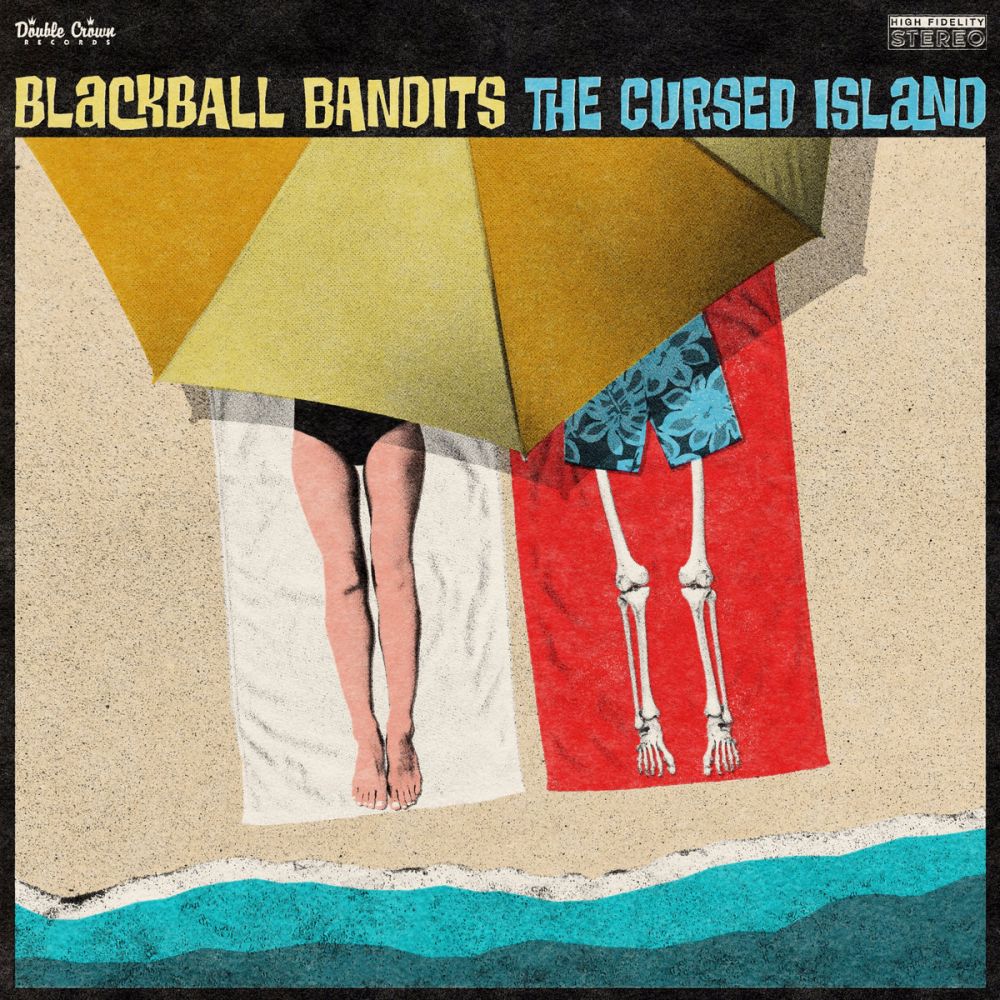
Blackball Bandits - The Cursed Island
art by Clark Wilson
I believe all of Blackball Bandits' artwork has been done by their drummer Clark, and I'd say that each release has looked a little bit better. Except for this one, which I think is a bit of a jump! It's painting a scene, and a pretty funny one at that, and it grabs your brain. I love the flatness of it too, with the waves super-simplified and the skeleton's trunks humorously devoid of depth. The textures and color choices are great too, particularly the red towel in contrast to the black & white towel to the left, ironically making the skeleton appear more alive. Minimal and colorful, but says a lot.
\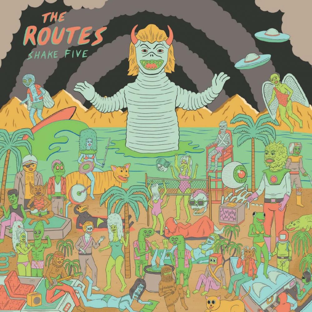
The Routes - Shake Five
Art by Joseph Harmon
I had a vinyl copy of The Routes' Instrumentals, I spent more than I normally would to import a vinyl copy of Instrumentals II, pretty sure I've got a copy of one of their garage rock records too, and when Shake Five was announced... I ended that trend. Shake Five does have a vinyl release that looks like this:
Sure, I like ladies with guitars, but I've seen ladies with guitars. I have not seen a bikini babe with a gecko head, ETs cooking a diver in a cauldron, a beatnik bat, or a game of volleyball with three heads and 8 arms. It's pretty regular as far as Joseph Harmon's stuff goes, but it's a lot of fun and I wish that the small details of this could be seen at 12 inches size instead of CD-size.
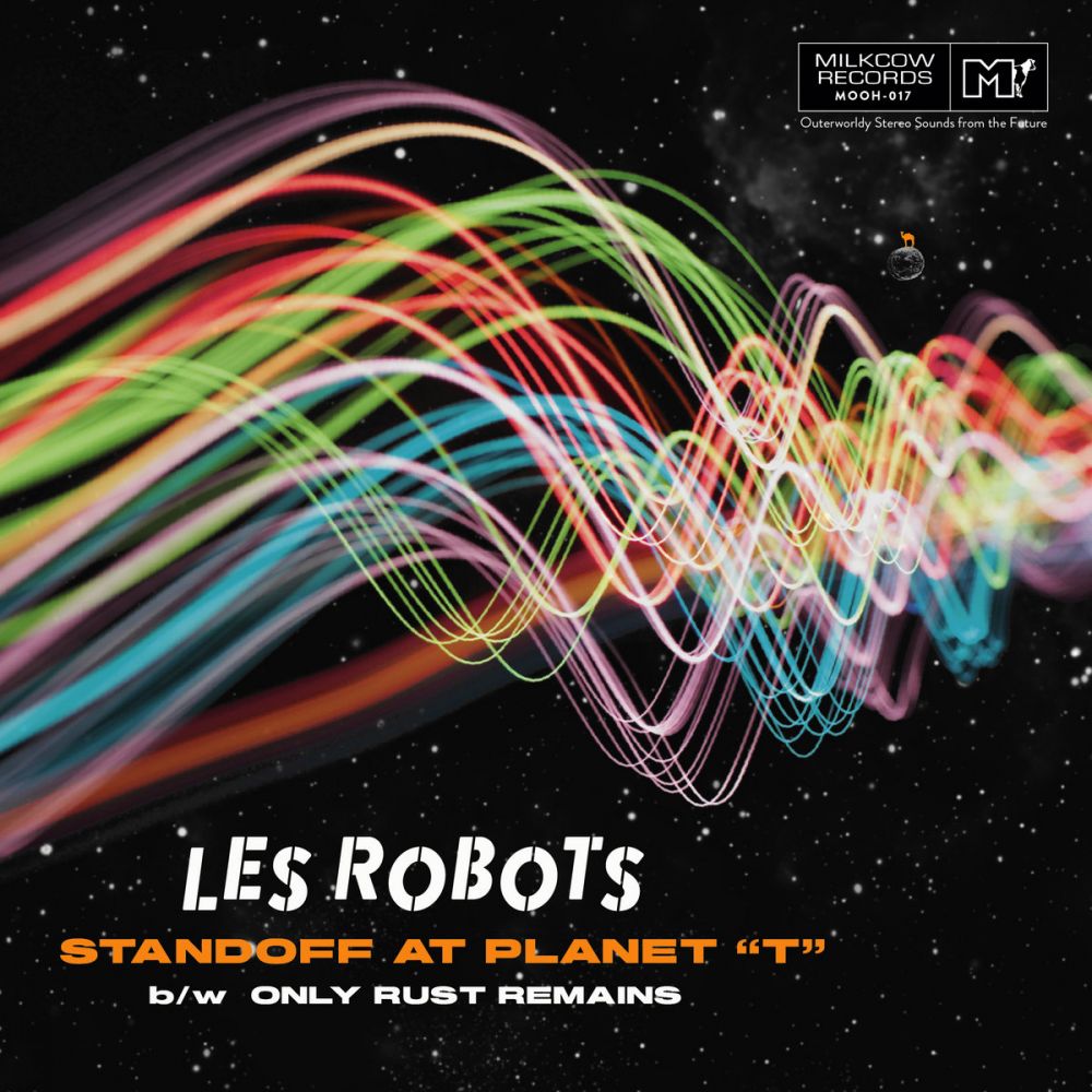
Les Robots - Standoff at Planet "T"
Art by Peter Cruise
Conceptually pretty simple, but executed to a "T". Colorful waves of what I we might assume to be sound beaming across space, with some bokeh making this abstract form feel real. The text feels just where it ought to be graphic-design-wise and there's a fun nod to a previous 7".
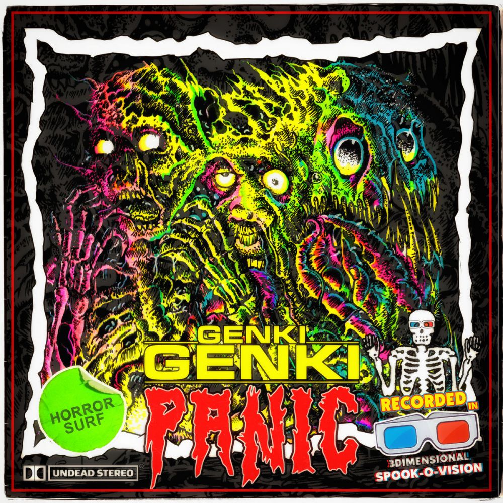
Genki Genki Panic - The Munge
Despite the spook-o-vision glasses, this cover reminds me of another gimmick that I very much bought into as a teenager: black light posters. This melting chimera monster is pretty wild, but the neon rainbow illuminating it (and the subtle layer of gray) really brings the chaos over the top. There are so many horror movies that I've never seen but I'm aware of from browsing blockbuster, and just like those this album cover won't let you walk past without noticing it.
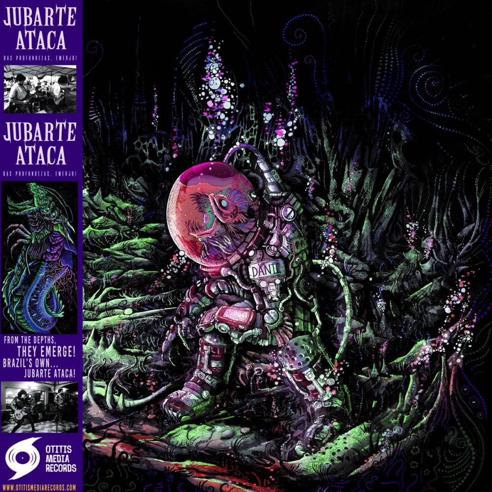
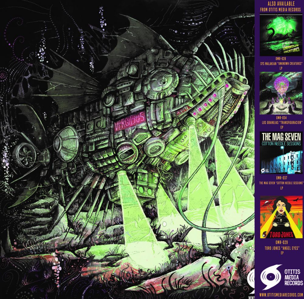
Jubarte Ataca - Das Profundezas, Emerjo!
Art by Sandro Freitas
I bought a vinyl copy of this about 10 seconds after seeing it -- without even hearing a note. A great hand-drawn biomechanical underwater scene with atmosphere for days and details you can stare at for a whole side of listening. But wait -- did you check out the back? Or the included poster??? I do have one complaint though: I really, really wish this were gatefold so I could see front and back in one continuous image.
Back:
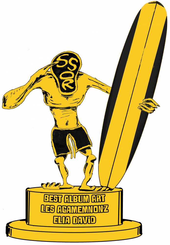
And the Gremmy Goes To....
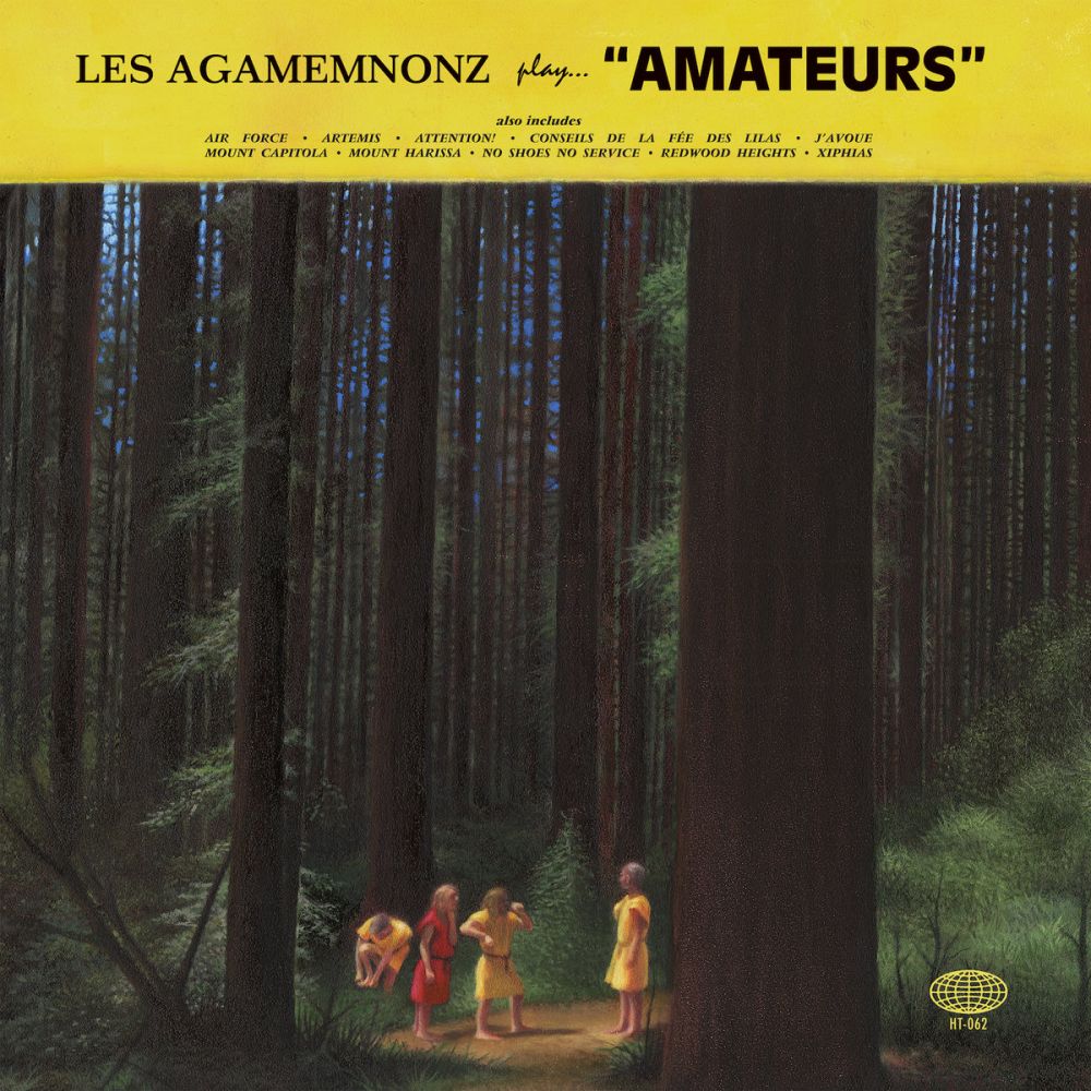
Les Agamemnonz - Amateurs
Art by Elia David
To talk about this album art is to speak parallel to the music itself, walking a confounding line between lampoon and sincerity. There's a thick, inescapable mood in this stunningly professionally painted tall forest surrounding the band, with the members both dwarved by natural elements and standing out strikingly by contrast. But in case you're lost in that mood, make sure to appreciate the humor; Les Agamemnonz' togas are pretty funny (they're pictured here in their performing garb), and in case you can't appreciate that they have one member clutching his feet, punished for staying barefoot in this landscape. Another subtle humorous contradiction is in the layout, with the solid yellow bar mimicking classical LPs, particularly Deutsche Grammophon, not only announcing a surf group with more dignity than traditionally ascribed, but sabotaged by the title of the album "Amateurs". Beautiful and playful, that's Amateurs, that's Les Ag.
Here's your .png file.