The first Gremmy category is a bit of an outlier, as it doesn't really pertain to surf music itself. Album art! However, I think surf as a genre has had a pretty strong visual identity over the years, dating all the way back to its inception. The value of this feels even stronger now that so many bands are simply generating pictures of a surfer riding a huge wave 5 feet from the shore (why is it always like that?). Plus, The Grammys have this category, why shouldn't I?
Honorable Mentions
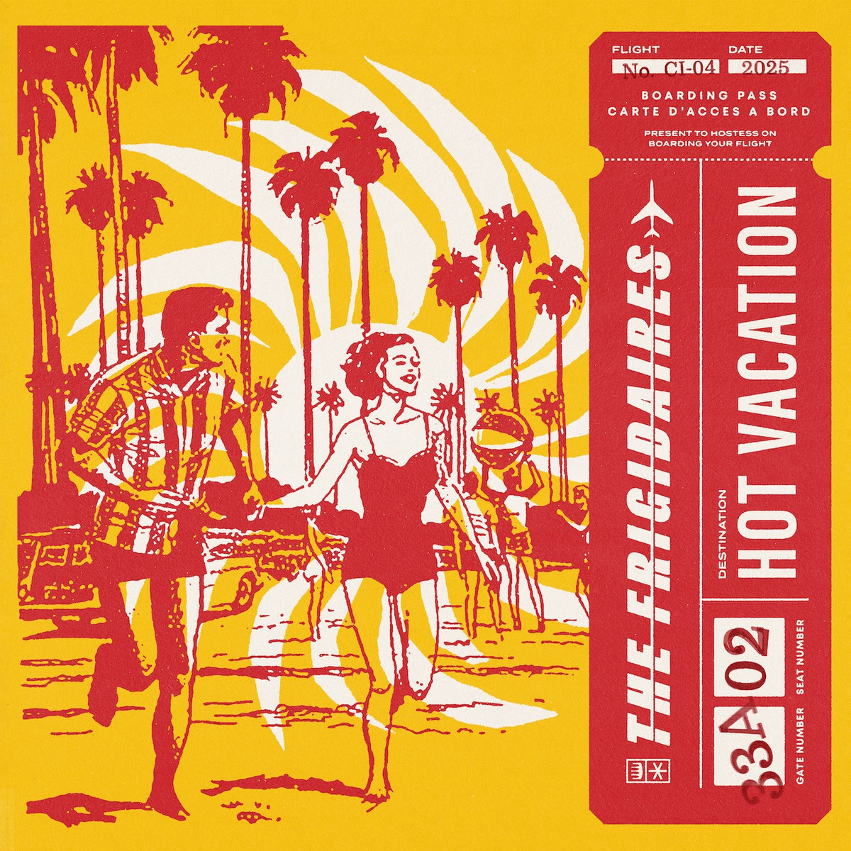
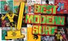
The Frigidaires - Hot Vacation
Art by Scott Sigiuchi
There are artists that used to be regulars in surf design that seem to have gone quiet, and Scott Sigiuchi has been the guy filling the void. This year alone I can think of several other albums, show posters, and other media he's worked on off the top of my head. His style, steeped in vintage low-quality magazine printing, is immediately recognizable but flexible enough to not get stale. This one stands out to me, slipping in perfectly with The Frigidaires' brand of nostalgic but energetic fun. One bonus for going with somebody so design-heavy is he's very capable of doing the layout too, and the back of the LP is great, finding space to include a signature cocktail recipe for the album! I liked this album's cover enough that I bought a shirt with the design.
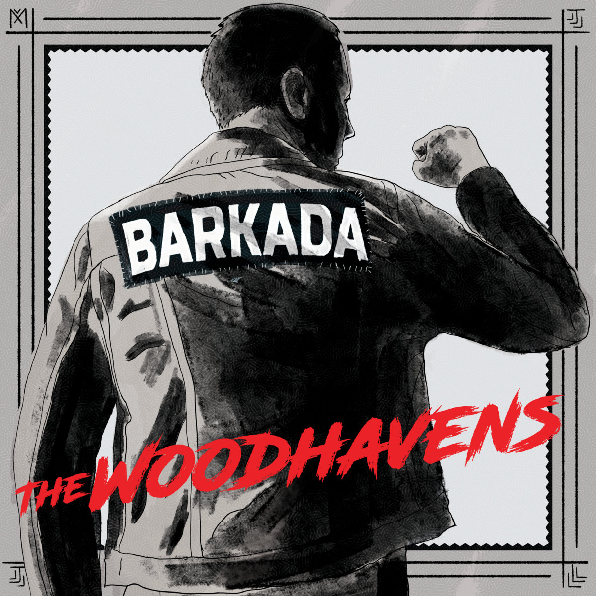
The Woodhavens - Barkada
By Heather Shelini Alabado / Visual Num Nums
This is an example of album art being effective, first and foremost. It feels like it came from a solid vision and wanted the viewer to engage with it in a certain way. Technically speaking, it's well done, with what I believe is a digital painting mimicking a charcoal drawing, and with even that loose rendering passing for black-and-white photography when shrunk down enough. But this image of this leather-jacket-clad figure confidently pumping a fist feels meaningful, and begs you to ask, if you didn't already know (I didn't), "What the heck is a barkada?" It seems very important to this man and presumably to The Woodhavens! Loosely speaking, it's chosen family, a close-knit group of friends, and this word mixed in with the tough punk messaging on the cover image, audibly guides the music within the album.
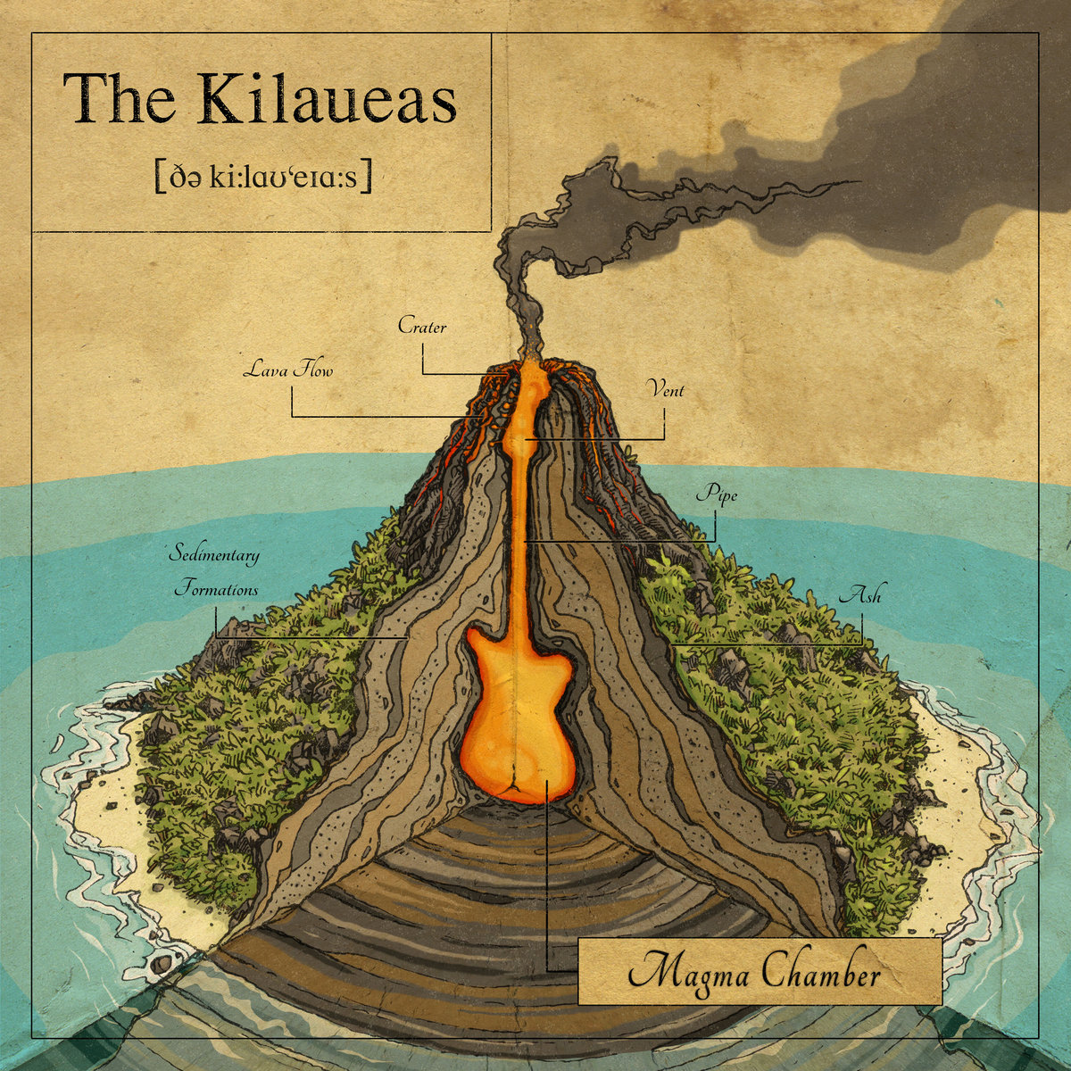
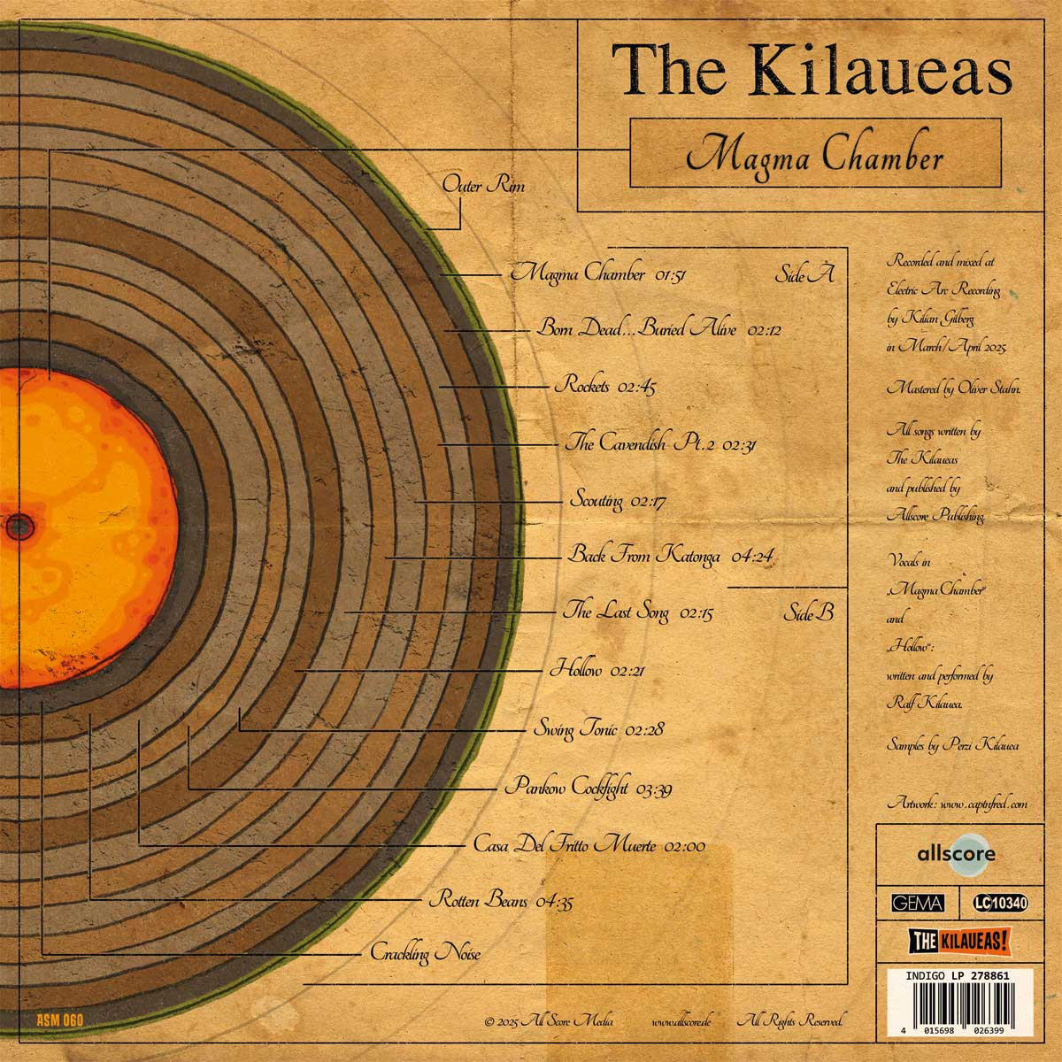
The Kilaueas - Magma Chamber
by Captain Fred
A cutaway of a volcano, made to look like a diagram from a science book, with labels for the different parts of a volcano, and the titular Magma Chamber shaped like a guitar. I might have preferred it done in a more scientific style of sketch instead of the simplified, cartoony details, but it's a fun enough idea that I don't really care, and I understand sticking with the artist that did a great job with their past two LPs (one of which I've given an honorable mention before). The concept is pushed a little further on the back of the cover, where the cross-section is made to look like an LP, with each ring labelled with a track name. Obviously all twelve songs aren't actually on one side, but that's overthinking it.
The Green Reflectors - Bonshaw 500
And the Gremmy goes to...
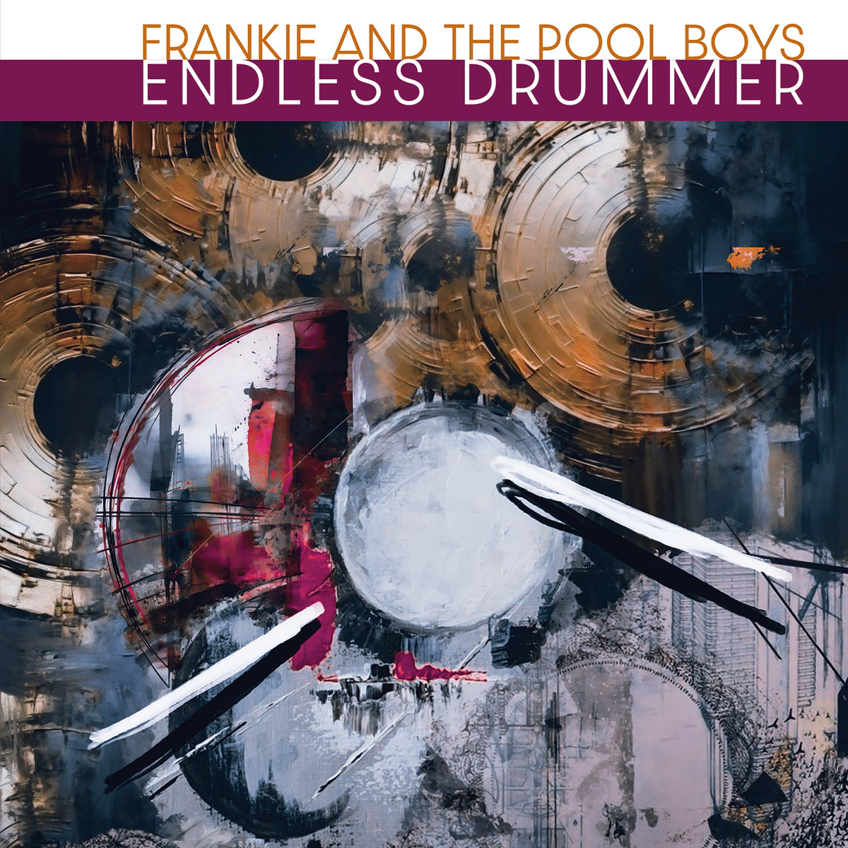
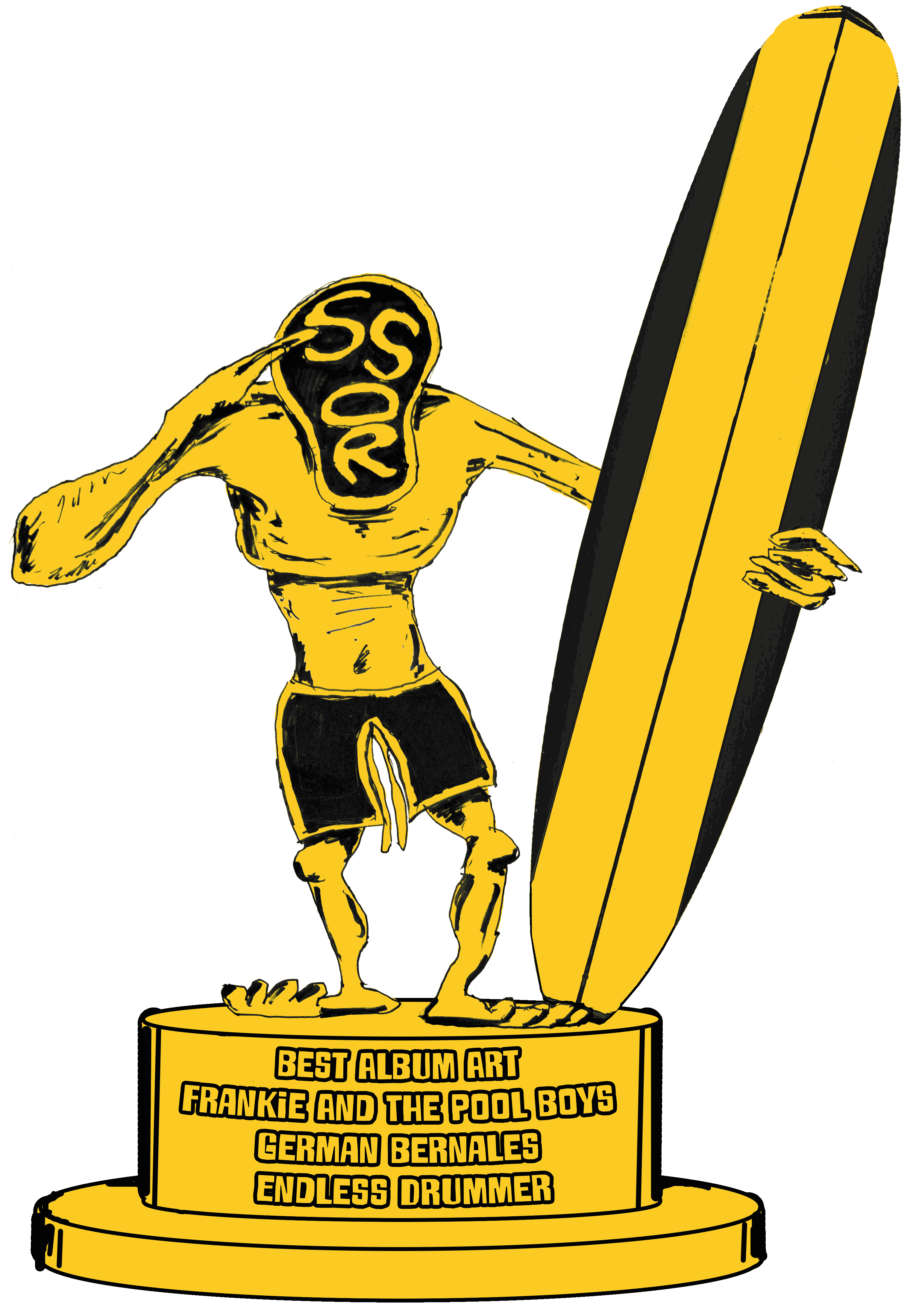
Frankie and the Pool Boys - Endless Drummer
And so here's another album art Gremmy to Frankie and the Pool Boys! Let's bless this beautiful work of art with a crappy .png file!