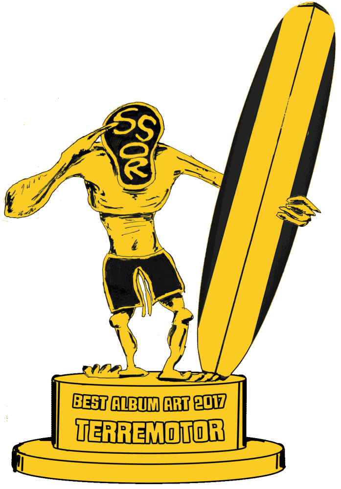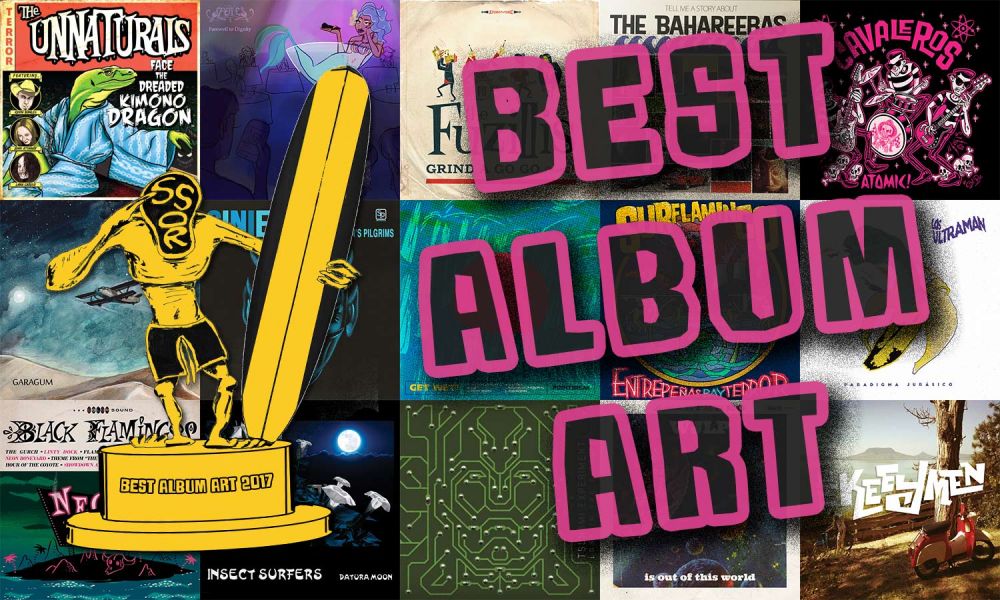
I’ve heard a lot of great surf records behind terrible album art, but some good art can not only draw you in but shape your listening experience. And in a style of music that is so attached to kitschy paraphernalia, it’s interesting to see how bands can either harness or subvert those associations to stand out and even shape instro culture.
Honorable Mentions
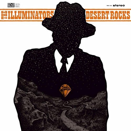
The Illuminators - Desert Rocks
All of the Illuminators releases have had very intricate and impressive album artwork, but Desert Rocks gives your curiosity a little more direction than their earlier more abstract work. Who’s this guy. What’s he doing in the desert? What’s this gem? It’s instrumental so good luck with the answers, but it certainly draws you in to listen. I love the creativity with embedding the desert scene within the suit, essentially getting two images in one.
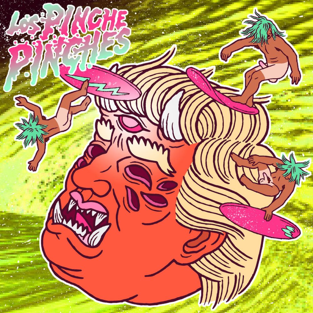
Los Pinche Pinches - Los Pinche Pinches
It’s ridiculous. You’ve got a few faceless, naked and erect surfer dudes catching the waves of the hair of a demon Trump. It’s stupid fun which is often how I feel surf should be. There are little touches in there like the pixelated background, the spray texture and the suprisingly well-drawn anatomy of the surfers that tip you off that this chaos was crafted and not accidental, but what difference does it make, really?

Satan’s Pilgrims - Siniestro
This one gets in here for ingenuity and bravado. The vinyl packaging is a paper sleeve covered in suede with the graphic screen-printed on. It’s actually not the only record I have like that, but it still feels so premium and special. As for art itself, the lettering is a subtle nod towards 60’s stylings, and the face itself doesn’t necessarily thrill me, but I think it’s emblematic. As Satan’s Pilgrims first trad surf record in over 15 years, I think that devilish grin is a cocksure statement as to the content within, and I love that attitude.
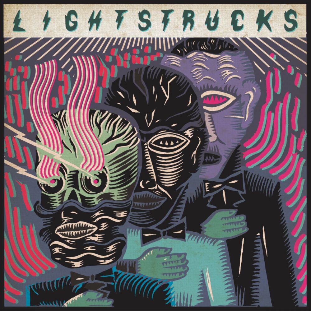
Light Strucks - Light Strucks
This LP builds on the colors and styling of the EP they released last year, and if they want to stick with it I wouldn’t blame them. The colors are fresh and unexpected, and the style of the strokes is striking and interesting. It makes me think the music is energetic and interesting, and that’s about all you need to know.
And the Gremmy goes to....
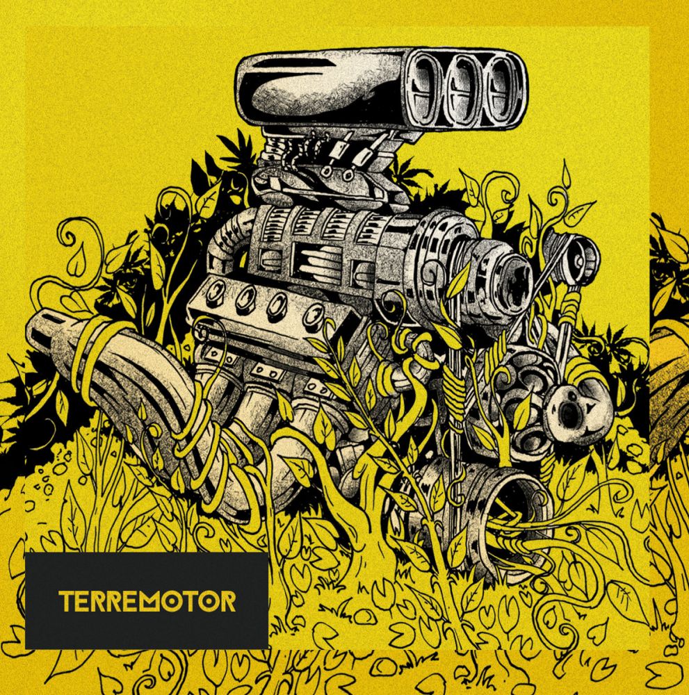
Terremotor - Terremotor
While these rock & roll instrumentals may be attached to surfing in their name, we all know there’s something about motorsports that just feels so naturally attached to this music. Maybe it’s the speed and the rumble, the feeling of power. Terremotor certainly aren’t the first band to recognize that, but the sight of manmade power being ensnared by earth’s slow-moving tendrils is perversely intriguing. Based on the band name, that dichotomy is probably pretty meaningful for them, though I have no special insight into it. But beyond the concept there’s other things that make this work. The choice of yellow and grayscale is bold and challenging, I love the subtle grit, and the technical quality of the drawing is fun to examine. The placement of the text is understated and adds to the drawing rather than distracts, and even the font choice is unique and intriguing.
