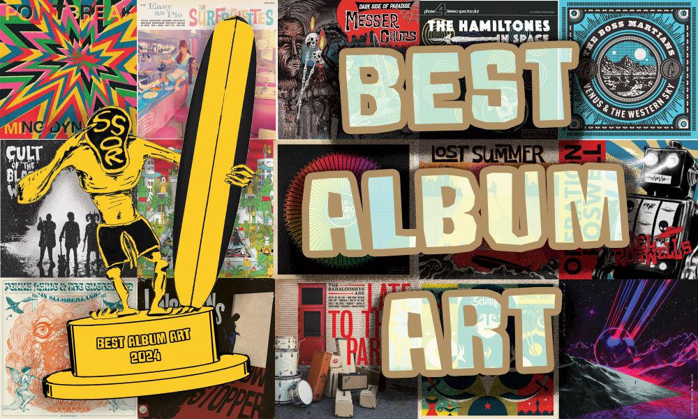
I like to listen to things, but I also like to look! Here are surf records that I thought were nice to look at.
I think the visual vocabulary of surfing culture and surf music has a lot to do with its strong legacy and it's retro appeal today. It's especially important to recognize these efforts in the face of growing AI usage. Here are some standouts from this year.
Honorable Mentions
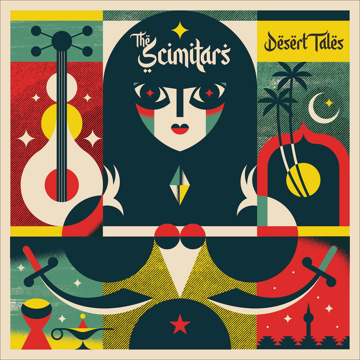
The Scimitars - Desert Tales
By Dr. Alderete
I've seen plenty of Dr. Alderete over the years, and last year he won the Gremmy in this category. And yet I didn't realize this was him until I looked it up! He has plenty of different styles, but this is one I haven't seen from him before, leaning heavily into simple playful geometry and using colors outside his day-glo wheelhouse. There's a lot being done and said here, but it's simple enough to feel controlled and meaningful. We're lucky to have an artist like him in our little corner of the music world.
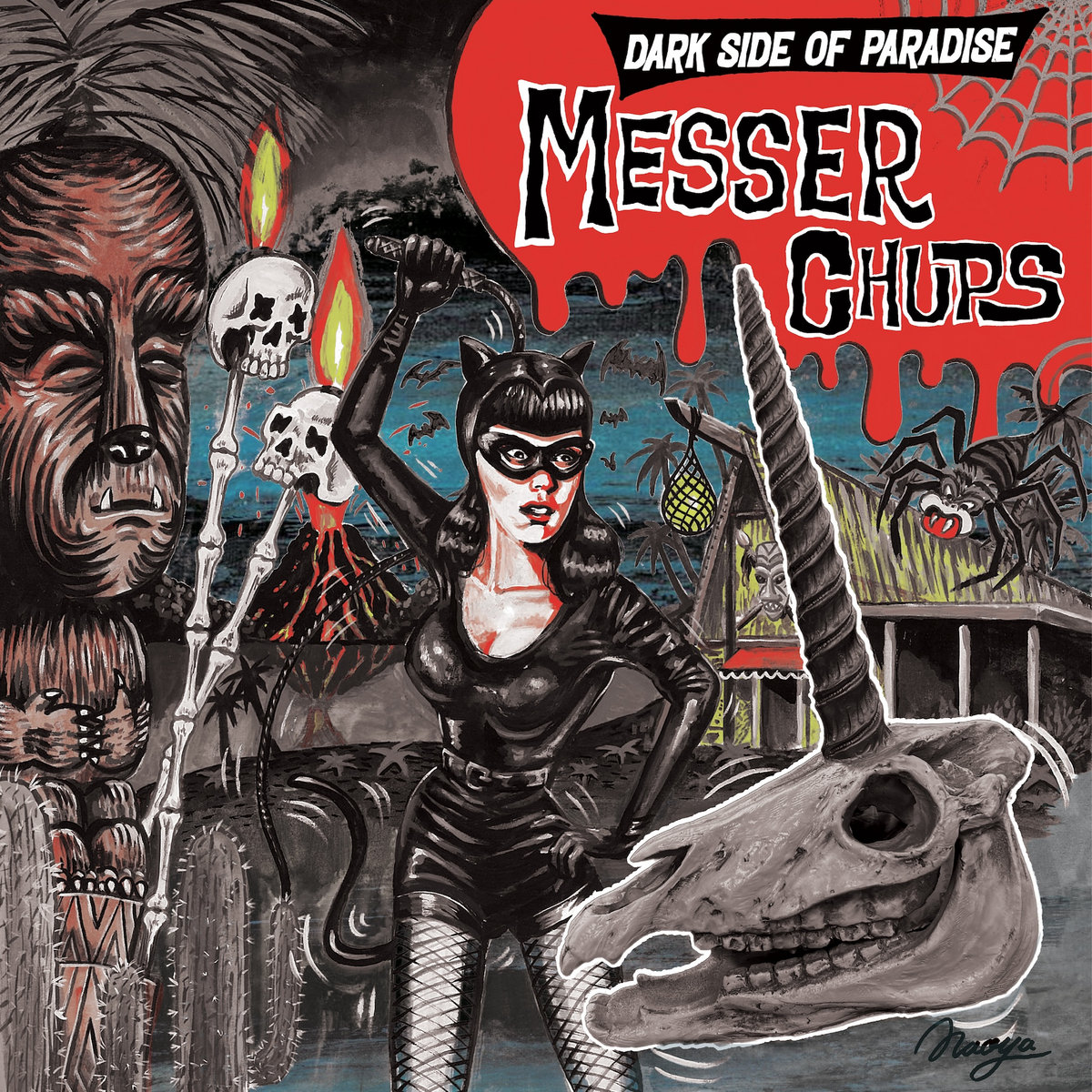
Messer Chups - Dark Side of Paradise
The Messer Chups' aesthetic is a big part of the whole act, and while I've never seen one quite like this, it works so well! The artist here is one of our own: Naoya Kawakami, guitarist for the excellent surfabilly band Bobby's Bar out of Japan. While generally I'd compare his work to Robert Williams (and being a self-ascribed low-brown artist, I'd guess he'd welcome that comparison), the somewhat desaturated colors remind me of the Ghanan movie posters. It's different from what we've seen from Messer Chups, but still very on-brand, which echoes the album itself!
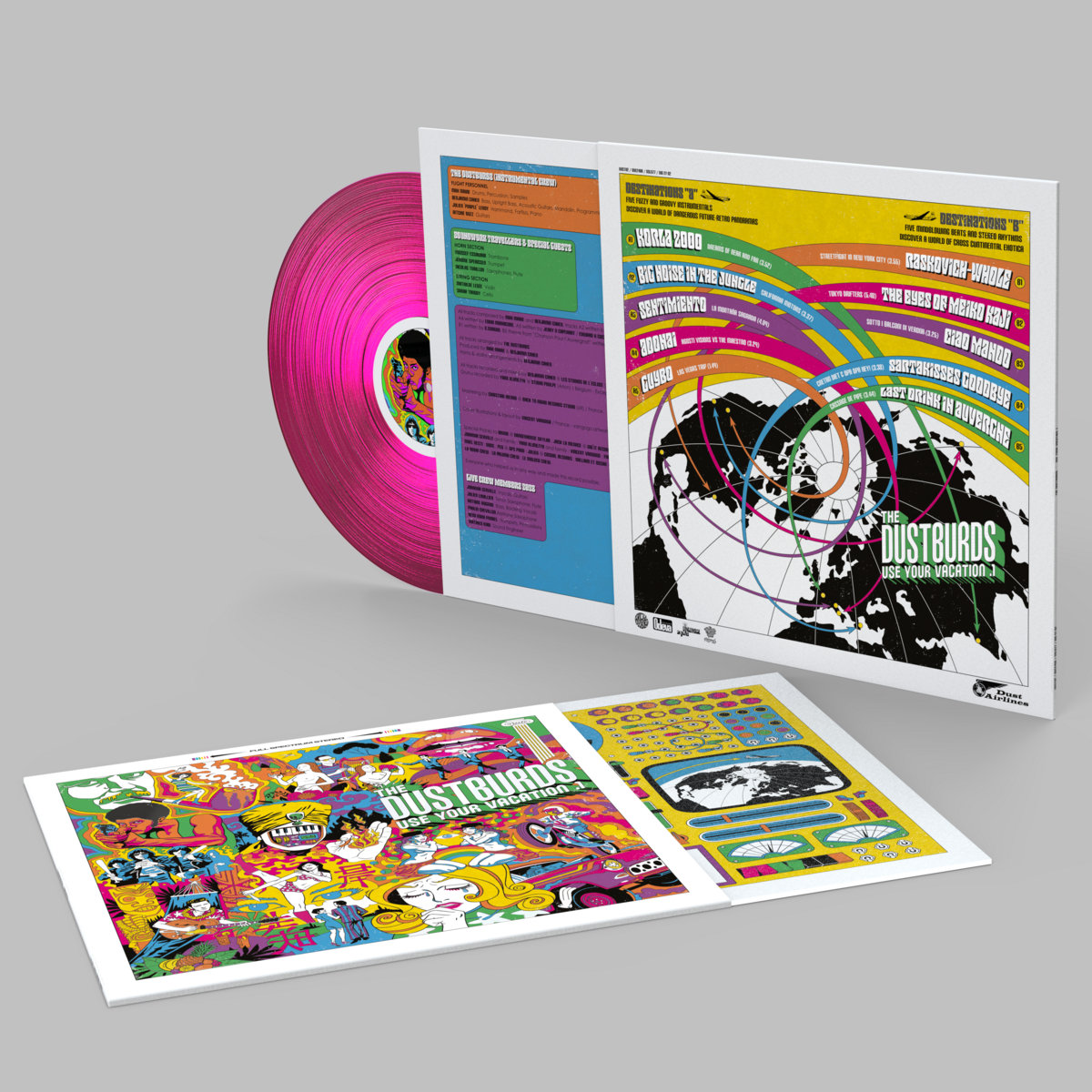
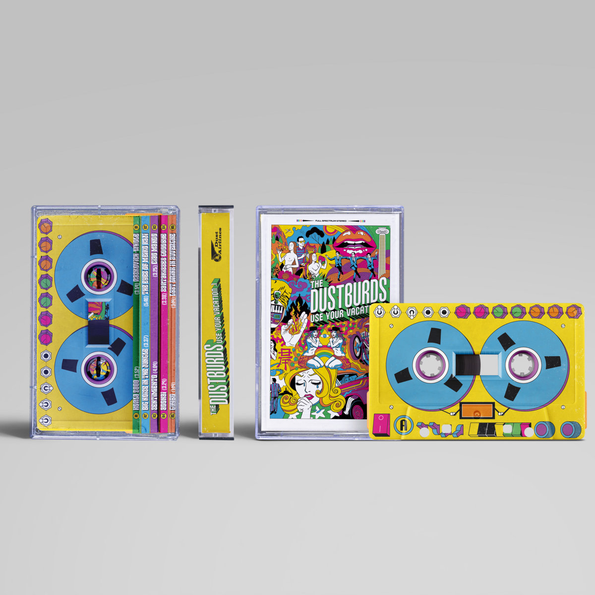
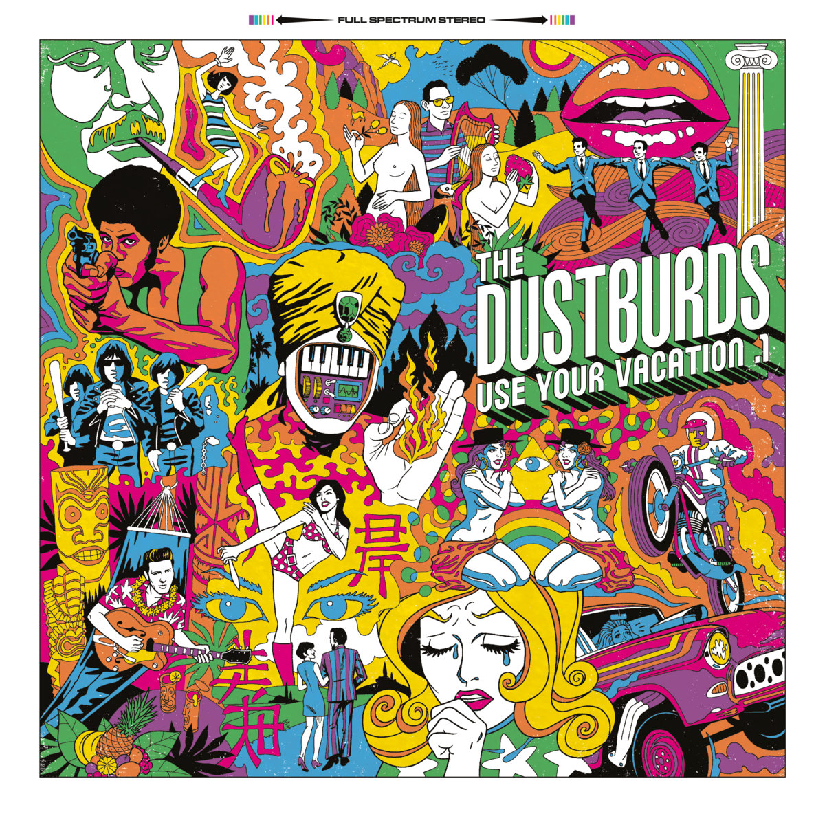 The Dustburds - Use Your Vacation I
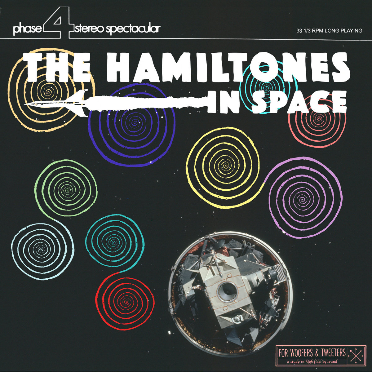
The Hamiltones - IN SPACE
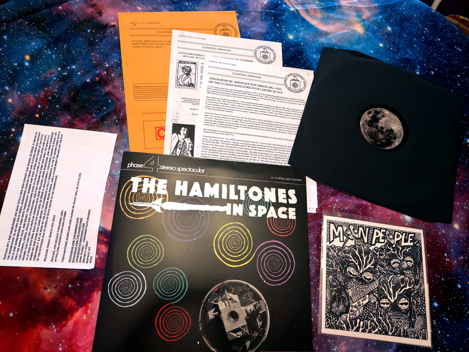
And if we're talking about packaging, then let's toss this record in. While the album art above is nice, it's not like it blew me away. But what did blow me away was showing up for my show, seeing I had a record from The Hamiltones waiting for me, opening it up and finding not only a record, but a sealed manilla envelope marked "classified", and a 7" from The Moon People. Inside the envelope were visibly photocopied pages outlining a wacko story behind the album (which, being instrumental, would not be obvious upon listening). So maybe this isn't about album art, but in terms of making an impression with their presentation, this was a winner.
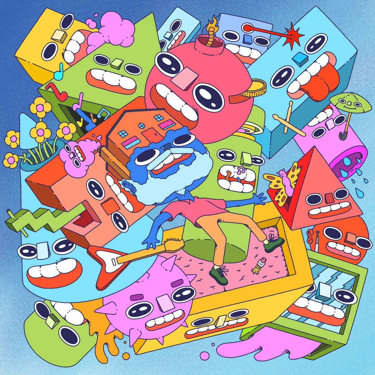
The Party Nerves - Go Broke or Go Home
When I look at this album cover I kinda feel like Mr. House-head in the middle, in awe and kind of freaking out. It's frantic, colorfully, silly, and a lot to take in. Does it say "surf music?" Well, I suppose there's a guitar! But it does make me want to hear it, and what I end up hearing isn't too far off from how it looks!
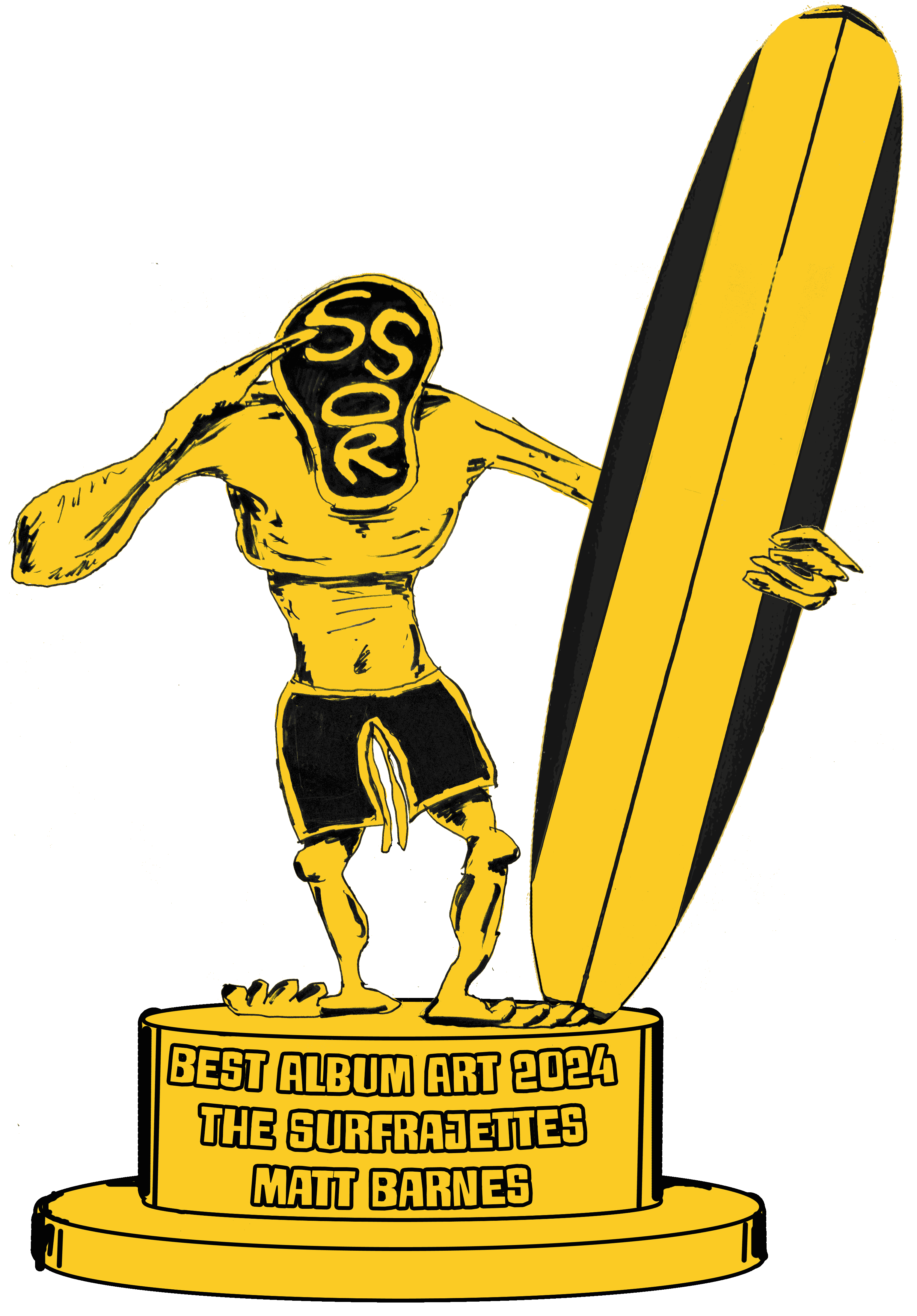
And the Gremmy goes to...
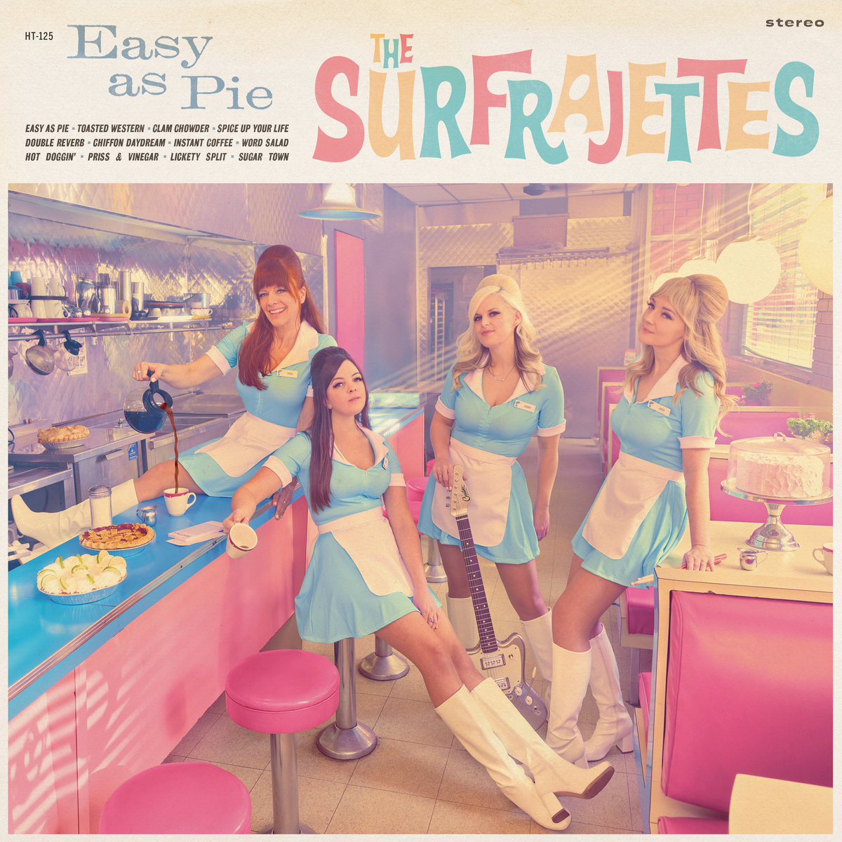
The Surfrajettes - Easy as Pie
Photo by Matt Barnes
Design by Chris Wilkinson
This Gremmy category is typically filled with comic-styled drawings because photographic surf music album covers are typically a fairly plain band photo or a wave. Even The Surfrajettes, a band that has factored in their look from day one, didn't actually use a photo for a release until their eighth one. But they made it count!
A quick look at photographer Matt Barnes' website and I think most surf bands would think "Welp, this guy is out of our league". Celebrities everywhere, ads for Fortune 500 companies, etc. And they all look excellent with wild, almost surreal coloring. And the coloring is a big part of what's going on here, color-shifted into Barbie-tone but with a little low-contrast haze for nostalgic feel. That light pouring in is just perfect, and I love the purple shading in the background.
All wizardry aside, it's pure Surfrajettes. It's steeped in mid-century nostalgia, bright and friendly but also warm and cozy and not in-your-face. The vibe you get from the album cover is the vibe you get from the record which is the vibe you get from their videos and live performances. Its only real flaw: they've stolen their own thunder for the cover of their coffee table book of diners visited on tours (which I made up). The flagship band for Hi-Tide (and arguably surf in general right now) deserved a super-professional treatment, and as a result Easy as Pie sounds and looks like a step up for the Surfrajettes.
