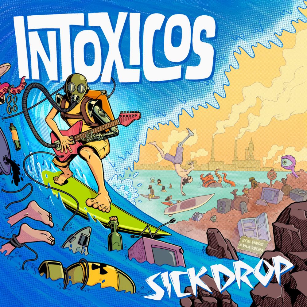
Andre Nucci used to play in Intoxicos, but their relationship can't be that toxic because he illustrated this cover! I love when somebody can take something done a million times (in this case surfing guitarist) and make it feel new. The garbage, creature's eye, two nuclear bombs, that stuff is fun. But I also just love way it's illustrated. That guitar-surfer's stance and the linework on it really sells the motion. And I love the bright colors that fade to pastels with perspective. This band's art has always been good (the extended art from End Times seen on their facebook banner is great) but this is their best yet.
I think album art is important. It warms you up to a record and sets the tone. When sitting next to a bunch of other records, it's what makes somebody stop and ask "what is this?"
I'll just say it, this was a surprisingly bad year for this category! I actually went ahead and checked up on a few artists that regularly make great surf album art, and it just seems like this was an off year. That's not to say that everything was awful -- there were plenty of records with good album art, but this is a category for outstanding album art. Things that would jump out at me even if I weren't a surf fan. Things that my much less surf-interested wife likes!
While I don't think this is to blame for the slow year, there was one disappointing trend: this was the first year that really featured a lot of AI generated art. I get it. Surf is not much of a profit-driver, and paying somebody for album art when you can make your own with zero talent and money makes a lot of sense. However when it comes to this category, I'm here to recognize and uplift artists, not the work of AI leapfrogging off their backs. There were even one or two that I removed from this list under close inspection for this reason. I expect that this will only be more commonplace in years to come, especially once they start portraying reasonable-looking guitars, which is all the more reason for this category to exist. Surf music has a lot of iconography, visual language, even typography, and I think we should recognize those that help create that.
Honorable Mentions
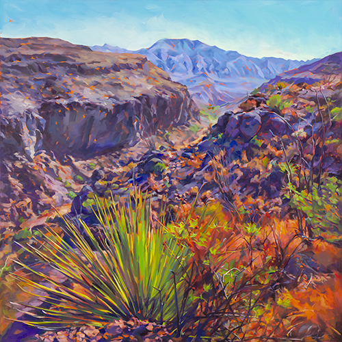
While I believe this painting by Felice House wasn't created for this album, this actually isn't her first venture into the Spaghetti Western-Surf world! Sheverb's Putamulletonit also featured work from her series that replaces spaghetti western film characters with women. Part of what I love about doing this category is familiarizing myself with the artists' wider body of work, and I love House's style, with her (deliberately) oversaturated out-of-place colors. And check out these landscapes!
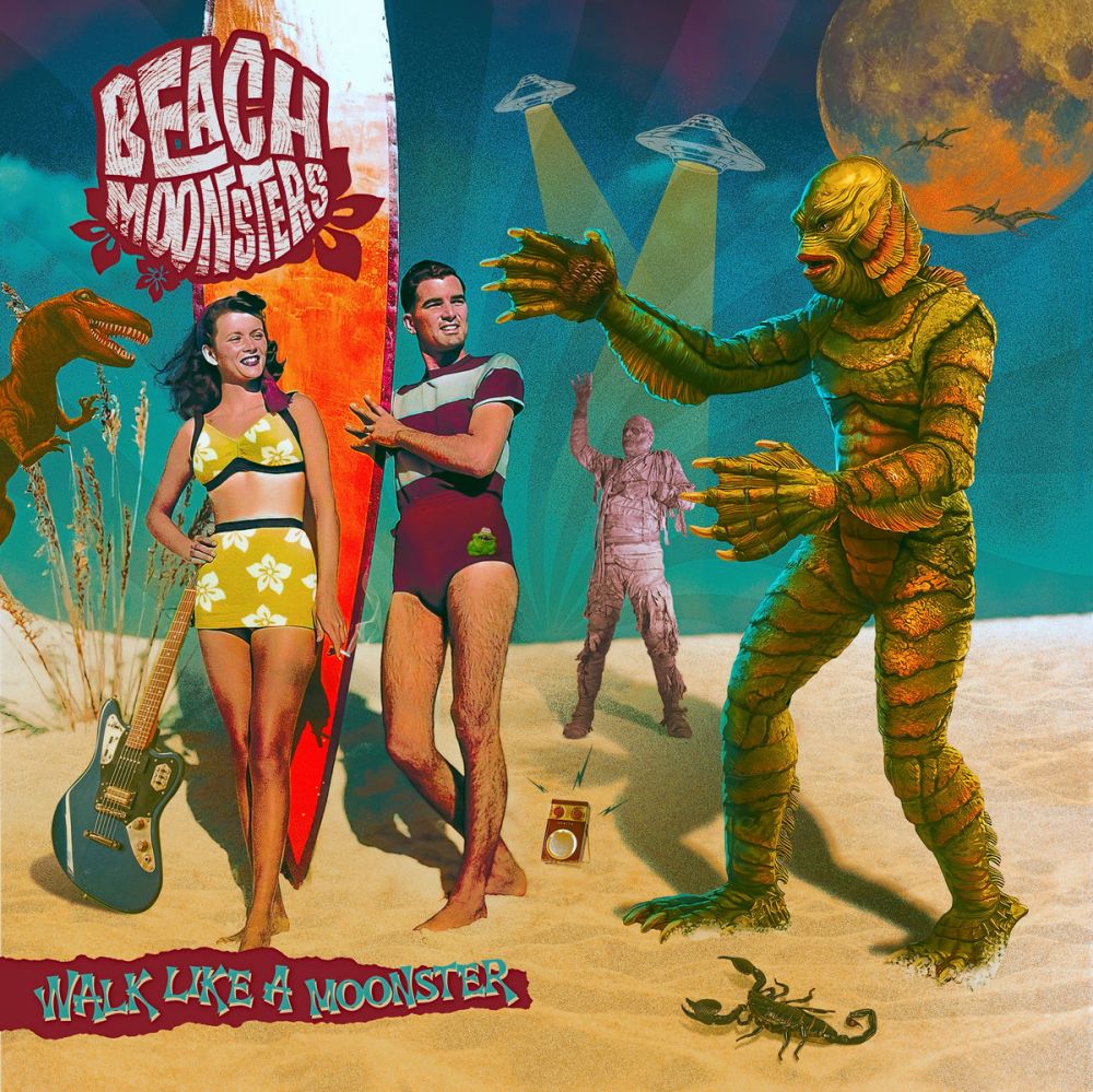
Not everybody can do stupid like this! I mean anybody with a little bit of photoshop skills can do a copy & paste job, but can you do it with a recognizable style? Artist Zi Infams retains the crude charm of collage while using genuine know-how to punch it up. A great example of knowing the rules well enough to break them. The result is something loud, crass, playful, and kitschy, which means it's a great primer for the music within.
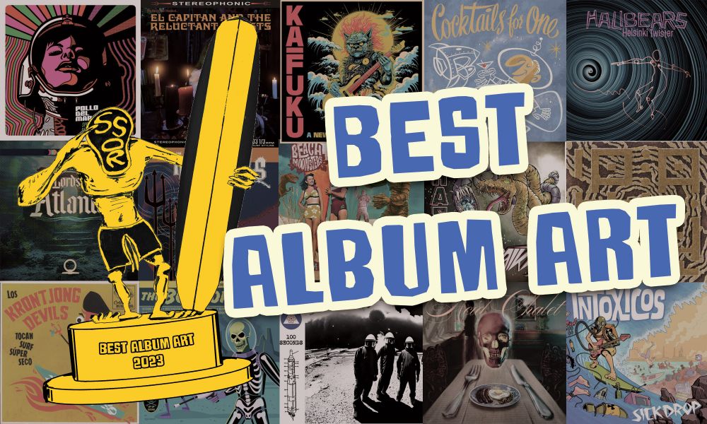
And the Gremmy Goes to...